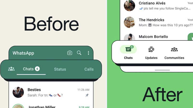
In an exciting development for Android users, Meta-owned WhatsApp has unveiled a major redesign of its app interface. The popular messaging platform has shifted its navigation bar from the top to the bottom of the screen, significantly enhancing ease of use. This change is particularly beneficial for one-handed operation, as it brings key features like Chats, Communities, Status, and Calls within comfortable reach of the user’s thumb.
This updated layout is not just a functional improvement but also an aesthetic one. WhatsApp mentioned in a post on X (formerly Twitter) that the new navigation bar is not only “closer to your thumbs” but also “easy on the eyes,” indicating a focus on both usability and design. This shift is part of WhatsApp’s ongoing efforts to improve user experience and keep the app intuitive and accessible.
The bottom navigation bar represents a significant ergonomic upgrade, particularly for users who operate their devices single-handedly. With smartphones increasing in size, the top-screen navigation had become less convenient for many. This update aligns WhatsApp more closely with the standard layout of many mobile applications, potentially making the app easier for new users to learn and navigate.
The change to a bottom navigation bar reflects a growing trend in app design, prioritizing ease of access and user comfort. By placing key functions within easy thumb reach, WhatsApp aims to streamline the user experience, making it more efficient and enjoyable. This update promises to enhance the overall functionality of the app, catering to the evolving needs and preferences of its vast user base.
For Android users, this update represents a welcome change, making their daily interactions on WhatsApp smoother and more user-friendly. As WhatsApp continues to innovate and adapt, it solidifies its position as a leading player in the global messaging app market, staying responsive to user feedback and technological trends.


